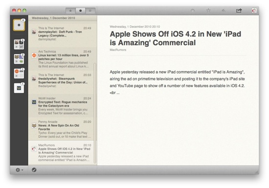
It's finally happened. Someone came out with a Mac OS application that's clearly a touch UI crowbarred into a point-and-click universe.
And it doesn't work.
The application in question is Reeder, a Google Reader client for Mac OS X. Yes, it looks pretty, and I feel kind of bad for making an example of it, especially since it's in early beta. However, the Mac App Store is bringing people over to the Mac OS from iPhone and the amount of "Why won't my iOS code compile on Mac OS X?" questions on the developer forums is making me worry. If you're considering porting your iPad/iPhone UI to Mac OS X (or any desktop OS, for that matter) please read this first.
So, I hereby present an analysis of the Reeder for Mac UI using Fitts's Law. I'll keep this as matter-of-fact as I can, but obviously there'll be some stuff in here based on my opinion — I am but human. If Reeder's designers are reading this, please don't take it personally, and use my criticisms constructively to make a better Mac app.
What is Fitts's Law?
It's complicated, that's what. See the Wikipedia article — the first thing you see is a big-ass formula. In a nutshell, it defines the amount of time it takes for a user to point to a given item on the screen from another point on the screen.
Fitts's Law on "Traditional" Computers
On a "traditional" computer — that is, one with a mouse pointer — the edges of the screen area have an important role to play regarding Fitts's Law. When the mouse cursor hits the edge of the space, it stops on that axis, but the other axis (i.e., up/down if you've hit the left or right edges of the screen) continues to operate. This makes hitting a non-specific point on the edge of the screen or a specific corner of the screen incredibly easy and fast — simply shove your mouse in that direction and you're pretty much certain to hit what you're aiming for.
An important part of the user's ability to hit an object on-screen is "overshoot". The further away the mouse pointer is from the target, the more likely the user is to "overshoot" the target and go sailing straight past it, unless they're aiming for the edges of the screen.
Fitts's Law on Touch Computers
On a touch computer — that is, one without a mouse pointer and direct interaction between your finger(s) and the UI — Fitts's Law is different in two ways:
1) There are no screen edges that limit your finger (well, you could argue that the end of the screen glass on devices that only have glass on the active part of the screen counts as a finger-limiting edge).
2) The removal of the abstraction between hand movement and interaction on screen. This, by-and-large, means that overshoot is less of a problem because there's no real "starting" point — the user doesn't have to move a "pointer" from whatever they were last interacting with to the new target. For all you know, the starting point for the click operation is the user's backside from scratching their ass.
What this means is that Fitts's Law is largely a non-issue in touch interfaces. Of course, fingers are fat and inaccurate compared to a mouse pointer, so a good UI on a touch device needs to have well-spaced, large controls.
A Practical Example of Fitts's Law
As much as I hate Windows, it makes excellent use of Fitts's Law. Take this screenshot:
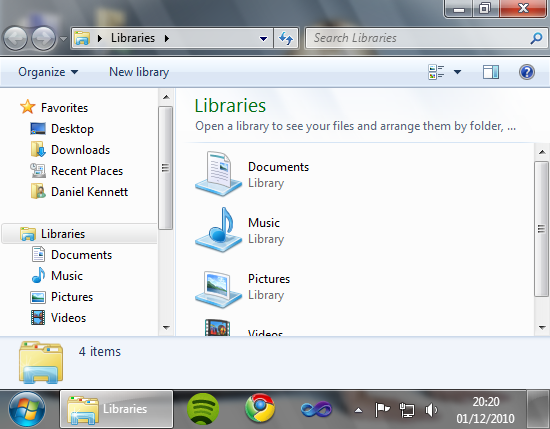
Every single corner has a useful function —
- Bottom Left: The Windows button's hit area is extended right into the corner, so down and left gets you the start menu.
- Bottom Right: The box at the right of the task bar shows the desktop when hovered over, so down and right shows you your desktop.
- Top Right: Up and right closes the current window as the close widget's hit area is extended to the corner.
- Top Left: Even though there's no icon there, clicking the top-left corner of a window gets you a menu with window functions like move, minimize, maximize, close, etc. Double-clicking the same spot closes the window.
Windows 7 introduced more features that make use of good execution of Fitts's Law — drag a window to the top, left or right of your screen and it'll automatically be placed into a sensible position. It's called Windows Snap, and you can see it in action here.
What if I ignore Fitts's Law?
If you ignore Fitts's Law, your users will find your application annoying to use, and they'll eventually start resenting your app and stop using it. I remember as a child, my Mother would accidentally print a document at least once a week. I used to make fun of her — "The computer just did what you told it to do!" — but it turns out this was a bad application of Fitts's Law — in Word 97 or whatever version it was had very small buttons, and the "Quick Print" button was right next to the "Save" button. They were both a long way from the bottom of the document where the user typically works, so when aiming for the "Save" button an accidental click is practically guaranteed now and then.
…but I need lots of little buttons!
Fine. Just pay attention to where you put them, and where the user is likely to be coming from when clicking them. For example, putting a "Quick Print" button next to "Save" when the user is coming from the other end of the screen is a bad idea. Put a less devastating button next to "Save". Or some dividing space. Preferably both.
Applying Fitts's Law to Reeder
Reeder for Mac has a great touch UI. The buttons are nicely spaced out, great for my fat fingers to mash on. However, when we add the traits of Fitts's Law that are prevalent on mouse pointer based computers — that pointing operations have a source location and the probability of overshooting scales with the distance between source and target — the UI rapidly falls apart.
Ground Rules
In the following section, I'm going to make some assumptions to simplify the analysis. If you feel I've got any of these fundamentally wrong, please, hit up the comments section to the right.
- From now on, we're only talking about users on "traditional", mouse pointer based computers.
- When interacting with a computer, a user tends to "follow" what they're looking at with their mouse pointer. Typically, this is because they're looking for stuff to click on. Even in consumed content like web pages, there are links to click, and following the words you're reading with the pointer is an incredibly common way to keep track of where you are.
- The keyboard doesn't exist. Or is broken. Or on fire and too hot to touch. Keyboard shortcuts aren't an excuse for bad UI!
The Mark (Un)Read/Favourite/???/Share Buttons
These buttons, in my opinion, will be used quite often by users. Personally, I often mark articles as unread if I want to read them again later, favourite them if they're great and share them with friends. I'm fairly certain a lot of other people do, too.
I'm in Reeder, reading an article. "This is amazing!" I think, and mouse over towards the "Favourite" button. As discussed above, my mouse cursor is probably over the content of the list of articles to the left.
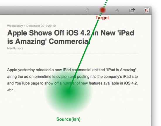
As you can see, while the buttons up there have lots of padding, it's in the wrong direction. The user is moving towards those (quite small) buttons from a fair distance away, and are therefore likely to overshoot. What if they do? They click the desktop, and Reeder is no longer the foreground app.
How would you fix it? It should be fairly obvious from the diagram that we need more vertical space for the button. The standard Mac OS X toolbar provides this quite nicely, and allows the user to make the buttons smaller if need be.
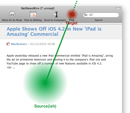
As you can see, this has several advantages — the target is bigger, so easier to hit. If the user overshoots, which is fairly likely given the distance the pointer has travelled, they've got a much bigger cushion (the titlebar) before a mis-click does something bad.
The Feed Management Button
This button allows you to add, manage and refresh the feeds you have in Reeder. In my opinion, this will be a lesser-used button that the ones above — I rarely change my feeds and my RSS apps are set to auto-refresh every so often. I don't believe this is an unusual use-case.
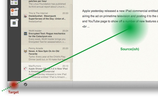
The source of the operation is less defined here. Above, I've diagrammed what would happen if the user finished reading their last article and wants to refresh their list, or add a new feed they've just read about. The operation could just as easily be coming from directly above.
In either case, the button is much easier for the user to click.
Just for Funzies…
Just for fun, I opened the iPad Simulator and moved Reeder for Mac over it. Here is the screenshot, unedited except for scaling.
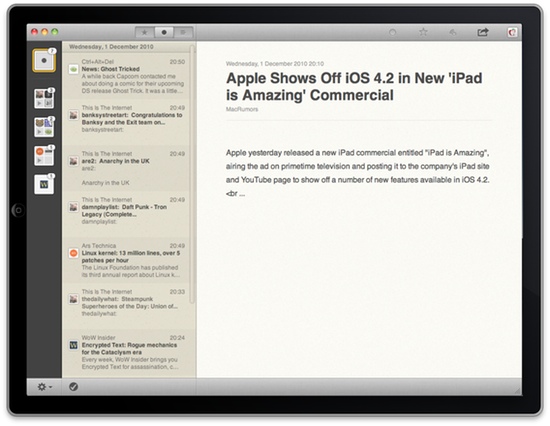
Remove the Mac OS X window widgets and that could be a screenshot of a native iPad app.
This is NOT how to make Mac apps, guys.
Conclusion
At first glance, porting a touch UI to a "traditional" computer may seem compelling — I mean, the mouse pointer is more accurate than a finger and big buttons aren't a bad thing, right?
No, they're not.
However, desktop operating system aren't touch-based. There's a hundred reasons not to do a straight port like this, and I've only touched one of them here. The extra limitations imposed by Fitts's Law on "traditional" computers mean that touch UIs typically simply don't work in mouse-driven environments.
AppKit and UIKit are different frameworks for a reason. The designers of your target platform are smarter than you, and have already thought all this stuff through — work with the native controls and design elements and your UI will be usable. Once it works, then make it pretty.
