In my opinion, the key to great design isn’t what you put into the given thing you’re designing, but what you don’t. These days, technology is everywhere - hell, even my car key has a little computer in it. As these things keep competing with each other, all the devices are keen to shout “Look at me! Look at how clever I am, and all the things I can tell you!”
Stop. Please, for the love of God, stop. This is getting worse and worse. Stop adding everything just because you can. Instead, ask yourself the key question:
How does this help our users?
Adding information just because you can is a bad idea. Why? Let me give you three examples.
Example 1: Home Entertainment
My home entertainment system comprises of a TV, a “Home Theatre” style amp, and several sources. The sources all plug into the amp which is in turn connected to the TV and some speakers. The components in this system all did well at supplying information. As you can see, my Philips TV shows a little red light to show it’s on standby. That’s useful information - if there’s no picture, I can instantly see that it’s because my TV is off.
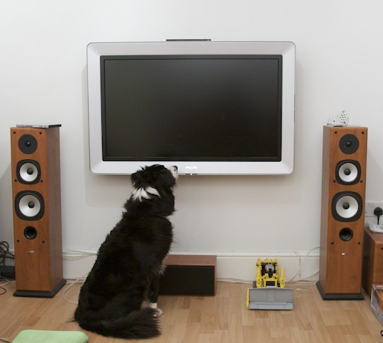
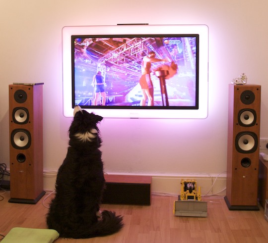
When you switch the TV on, the light goes blue to tell you that it’s on. However, as soon as the TV displays a picture, the lights goes off. This is also useful, as if there’s still no picture I can tell that it isn’t because someone unplugged the TV. As soon as a picture is displayed, the light goes off, because the TV assumes (correctly) that the light isn’t needed to tell the TV is on, because the screen is displaying a massive picture.
My amp is a Yamaha, and shows all its information on the screen on front of the box. It says which channel it’s on, and the format of the audio you’re listening to. This isn’t really useful normally, but good for troubleshooting if things aren’t working right (are the rear speakers not playing sound because they’re disconnected, or because I’m only listening to stereo audio?) or the TV isn’t showing a picture. 99% of the time, though, this isn’t useful, but the amp goes in a cupboard and you can’t see it.
Someone I know owns a Bose amp, and you get an external screen that sits under your TV that tells you which channel you’re on and the format of the audio you’re listening to, like the Yamaha amp. That, in my opinion, is a prime example a of completely wasteful use of technology. I know that the amp is on the “Playstation” input, because three inches above that stupid little screen I have a 42” image of a Playstation’s menu, and Playstation noises are coming out of my speakers.
Moreover, this starts to detract from the enjoyment of the entertainment system. Instead of switching the lights off, settling down and enjoying an immersive experience you’re noticing that the film is only in Pro-Logic II, and you could be getting a more immersive sound. This psychologically affects your perception of what you’re hearing, and you lose the suspension of disbelief that makes movies so enjoyable. If that stupid screen wasn’t there, you wouldn’t know or care how many channels the audio was in.
Example 2: Aftermarket Car Stereos
When driving, it’s vitally important that you’re not distracted by useless information, and when designing human interfaces for cars it’s actually dangerous to barrage the driver with useless information. In fact, Volvo have something called “Intelligent Driver Information System” in their cars which actually delays non-critical information while you’re busy negotiating junctions or twisty roads with aplomb. Pick any “normal” car with a inbuilt stereo, you’re likely to find something that’s been integrated well with the car’s aesthetics and in some cases, thought has been put into the UI. A great example of this is, again, Volvo:
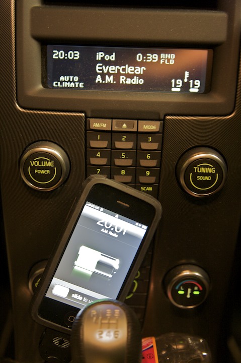
On the screen, it’s telling me:
- That the time is 20:03 (Useful)
- That I’m listening to the “iPod” input (Useful)
- That the track is 0:39 in (A bit useless, tbh)
- That the tracks are being played randomly, by folder (Useful)
- That the current track is “A.M. Radio” by “Everclear” (Useful)
- That the climate control is in “Auto” mode (Useful)
- That the climate control is heating both sides of the car to 19º (Useful)
- That when I turn the temperature knob, both sides of the car will be adjusted (Useful)
That’s eight pieces of information on a relatively clutter-free display. The fact that turning the temperature knob will adjust both sides of the car is also shown on the knob itself by the two LEDs on the centre, which is good because when you adjust the temperature, you look at the knob, not the screen.
The aftermarket stereo marketplace is a terribly, terribly sorry state of affairs. Go to your local car audio shop and look at the stereos on display - I challenge you to find one that isn’t covered in flashing, stupid screens. In fact, a friend of mine has a stereo with an “EQ monitor” that can’t be switched off that doesn’t even reflect the audio that’s playing! Put silence in through the Aux port and it still happily bounces away.
Take this sample from a random Pioneer stereo I found online that seems to have roughly the same pixel count as the Volvo screen above:

On the screen, it’s telling me:
- That it’s in “Demo” mode (Useful?)
- That it’s playing an MP3 (Useful)
- That it’s on folder 3, track 4 (Useful)
- The title and artist of the track (Useful, but makes Folder 3, Track 4 redundant in my opinion)
- That the MP3 is at 128kbps (Not just useless, but WTF WHAT WERE THEY THINKING?!?!?! useless)
- That you’re 1:01 into the current track (Again, a bit useless in my opinion)
- That you have bass and a subwoofer! (?!)
- That you have a CD in the player, and that it spins round (A pretty useless animation)
So, that’s eight things in total, four or five useful. And, that doesn’t include any climate or temperature information like the Volvo. The Volvo gets away with this by being clever - when you’re listening to your iPod and skip to the next track, it shows you the track number for a few seconds then reverts back to the Artist/Title view, scrolling the artist and title alternatively three times, then stops scrolling because it assumes that you’ve read the text if you want to know what it says (correct) and that constantly scrolling text is distracting (also correct).
Fortunately, though, it’s starting to get better. Look at Alpine’s car stereos and you’ll find some of them have relatively uncluttered, unuseless displays.
Example 3: Computers
Arrrrghh. This one annoys me almost as much as crappy, flashing car stereos.
Go to an Apple Store and look for lights on their computers. You won’t find many - the iMac only has one that tells you when the iSight is on. The Mac Pro has one for power. The MacBooks are christmas trees in comparison:
- A power light (that switches off when the screen is on)
- Eight LEDs on the side to show you the charge level of the battery, but only for a couple of seconds when you press a little button or unplug the charger
- The same iSight light the iMac has
- If you want to be pedantic, the Caps Lock light
Each light gives very useful information. The charge level lights allow you see the charge level without switching the computer on or taking it apart to get at the battery, and the iSight light lets you know that the webcam is watching your every move.
Compare that to my girlfriend’s Dell laptop:
- A power light that’s always on when the computer is
- A light that shows you the battery is charging
- A light that flashes when the optical drive is accessed
- A light that flashes when the hard drive is accessed
- A light that comes on when WiFi is switched on
- A light that comes on when Bluetooth is switched on
- Five lights for the battery charge level
- Again, if you want to be pedantic, three lights for Caps, Num and Scroll lock
Fourteen lights. W. T. F.
If you’re using that thing for anything other than a doorstop, there’s multitudes of lights flashing all the time. WHY DOES THE HARD DRIVE ACCESS LIGHT STILL EXIST?!?! Today’s modern operating systems move memory pages to and from disk all the time, so even if you’re not loading something, chances are the system will be doing housekeeping on its own, causing the light to merrily blink away.
My Approach
My approach follows that of Apple and Volvo in the examples above, in that I ask “How does this help our users?” for each item I put in, especially on iPhone. For example, take this screenshot of Music Rescue copying some tracks to my computer:
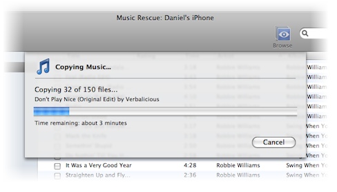
Notice what it’s telling you, but more importantly what it’s not:
- That it’s currently copying music files
- That it’s 32 files into a 150 file copy
- The track it’s currently copying is “Don’t Play Nice” by “Verbalicious”
- A progress bar showing a graphical representation of the progress of the copy
- The approximate time remaining
That last one is very useful - you can see that perhaps the copy will take an hour, and leave the computer knowing you won’t be wasting time checking its progress every five minutes. To calculate that figure, the program actually calculates:
- The amount of data copied in total so far
- The time it’s taken so far
- The amount of data still needed to be copied
- The speed at which data is being copied
I could show all of that to the user very very easily. However, I’ve chosen not to because none of it is terribly useful. The amount of data you’re copying is largely irrelevant while you’re copying - you get told how much space you need before you start, when it’s useful. Just to really get my point across, here’s a mockup of how the copy sheet would look with all that information:
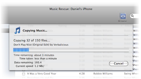
Cluttered, no? I try to stick to this ideal everywhere.